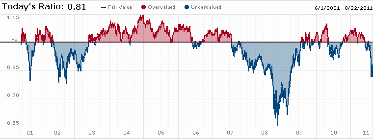
In the midst of recent market turmoil it is helpful to take a step back and take a look at the longer term picture. Today we are going to look at the Morningstar Market Fair Value indicator.

Per the explanation on the site:
Is the market cheap or expensive? The chart above tells the story based on Morningstar’s fair value estimates for individual stock. The graph shows the ratio price to fair value for the median stock in the selected coverage universe over time.
Of course no valuation indicator is perfect, but this Morningstar graph highlights well the issue at hand. At present the stock market is some 19% undervalued. On par with where it was in 2001-02 after the Internet bubble burst and big chunks of 2008 prior to the waterfall declines we saw. In the midst of those declines the market, according to this indicator, got 45% undervalued.
If this is a run of the mill market decline the stock market may very well have seen the worst of its declines behind it. However if things have to get worse before they get better, then the market could very well go substantially lower. Then again, nobody ever said this investing business was easy.


